IT company Cisco was created in 1984 and is easily identifiable by its iconic logo which is a tribute to San Francisco. What does it mean exactly? Here are a few answers about the origin of the Cisco brand.
With a workforce of almost 80.000 people and an annual revenue of more than $50 Billion, Cisco Systems is one of the world’s largest networking hardware and software solutions manufacturers. Like many other tech giants spurring from the fertile ground of Silicon Valley in the 80s, Cisco’s fortunes were tied to the timely intuition of its founders, who were able to translate research technology into a commercial success.
IP Violation
The company was founded in December 1984 by husband and wife Leonard Bosack and Sandy Lerner. The two computer scientists worked at Stanford University after graduating in 1981, helping connect the campus network and pioneering the idea of a LAN, or Large Area Network. With the help of his colleague Kirk Lougheed, Bosack applied a technology devised at Stanford in the 70s by William Yeager, a research engineer, without asking first for permission.
The co-founders quickly realized the commercial potential of what they had devised, but so did Stanford University, which sued them for IP violation. The legal quarrel stretched for a couple more years before the institution finally relented and licensed the router software that laid the foundation of Cisco’s IOS. By then, Bosack and Lougheed had been forced to resign from Stanford, and with Lerner and others, they formed the company’s first executive group.
Tribute to San Francisco

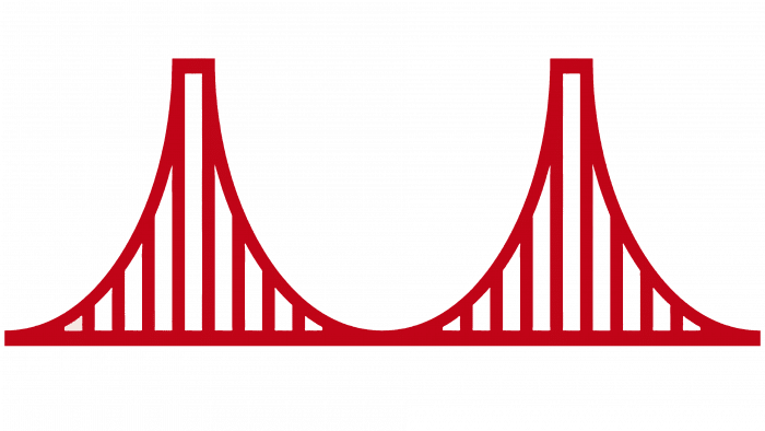
Cisco’s history, its beginnings, and its future growth milestones are reflected in the company’s iconic logo. Its first version was a stylized red Golden Gate bridge, shaped in a way that made it look like the depiction of an analog signal segment. The company’s name itself, Cisco, was born as a tribute to the city of San Francisco. While the Golden Gate connects the city with Marin County in the north, the company’s initial products would connect computers across a network.
In 1988 the founders needed more liquidity to expand the company’s business and accepted Sequoia Capital’s investment. The venture took control of the company in late 1987 and installed John Morgridge as president and CEO. It was Morgridge who ordered the first logo redesign during the early years of its tenure. The new emblem played more explicitly with the concept of a sampled signal and introduced the “Cisco Systems” lettering in red.
As the founders’ group gradually quit in the following years, the company’s business boomed. In the early 90s, Cisco launched new routers and operated important acquisitions that helped the company expand its market reach. By 1996, after John Morgridge retired and under the new CEO John Chambers, the company was ready for a new phase—and a new logo.
New Logo: A Discrete Signal
The new 1996 emblem put the Cisco Systems lettering on top of the same graphics, but the blue got darker, and the stylized Golden Gate Bridge came to look way more like a discrete signal. After all, it was the start of the Internet Protocol era, and the logo clearly reflected the company’s renewed focus.


The new symbol would remain untouched for about ten years until the new, bolder, and flatter rebranding campaign of 2006. That year the company adopted the shortened moniker Cisco, dropping the Systems to focus more on what a clever marketing push called the “Human network” in a namesake advertising campaign. The logo was flattened and rounded, while the Golden Gate symbol became more abstract and closer to the representation of a signal. Routers, switches, and communication hardware were still at the heart of the business model but the company started focusing increasingly on telepresence and communication hardware, a market segment that would become increasingly important.
The latest and final Cisco logo redesign came in 2013, when the company finally dropped the red and blue palette, picking a lighter blue as its one internet-safe color. The rebranding and the new focus were CEO Chambers’ latest legacy before stepping down in favor of Cisco veteran Chuck Robbins, who remains CEO to this day.


